Motorola Solutions
Public Safety-focused Infotainment System for Police Patrol
- UX Design Internship
- Strategic Concept
- Design System
Some details are generalised under NDA. Happy to walk through the full work in conversation.
Overview
Solving for safer: next gen in-vehicle system for police officers
As a UX Design Intern at Devices UX Team at Motorola Solutions, I took a full ownership for designing the strategic concept for next-generation in-vehicle OS, as part of the multi-device ecosystem, with a vision to deploy it within the next 5 years. I ensured the design aligned with safety regulations and operational needs, improving officer safety and efficiency during patrol.
As a lead designer, I…
- Established Design System for Vehicle
- Defined Human Interface Guidelines
- Led 17 User Testing Sessions
- Presented to 70+ Global Staff Meeting
What Improved
Impact
- System Usability Score
- 91/100
- Task Completion Rate
- 98.4%
- Presented to Global Staff Meeting
- 70+
Problem
The cluttered environment inside police cars disrupts patrol efficiency
Patrol vehicles are overloaded with variety of tech and devices, tablets, radios, multiple dashboards, and alert systems. This dynamic environment is mentally exhausting and stressful.
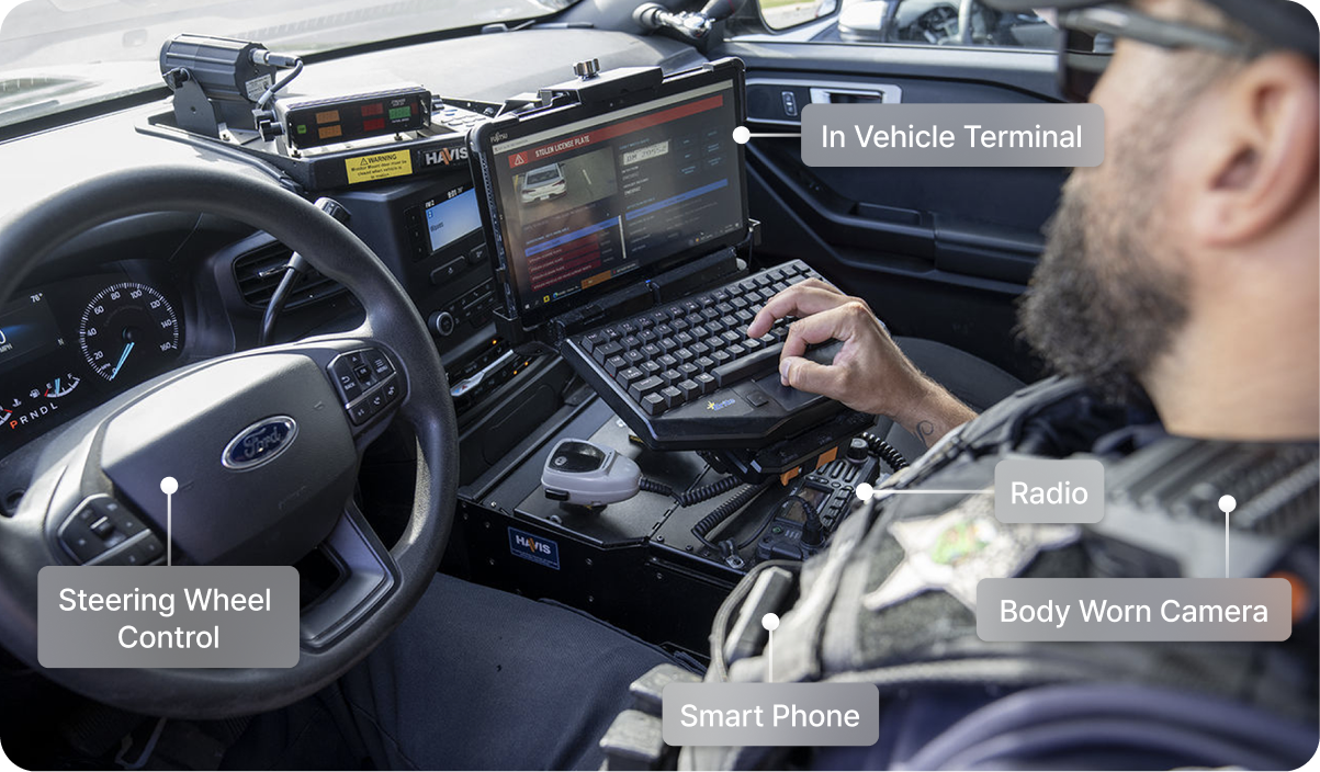
Potential Risks
- Information overload
- Missing critical information
- Making errors during high-stakes situations
Design Approach
Major pain points & insights
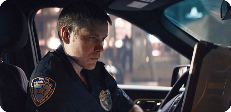
User’s perspective
- Less continuity across fragmented systems
- Information overload & High cognitive load
Business’s perspective
- Upsell apps & services subscription
- Lock customers into the ecosystem


Context Research
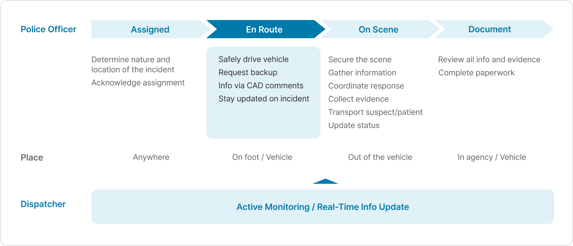
Examining patrol officer user journey
Prior to designing, it was essential to understand user’s tasks, barriers, and stakeholders from being assigned to an incident to resolving it. From the user journey, I found that the most interactive phase with the vehicle was ‘En Route’.
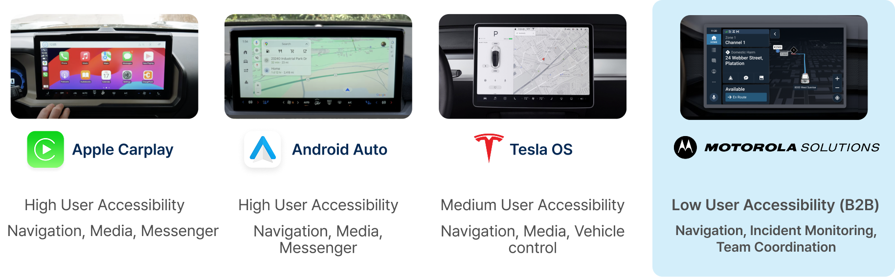
Competitive analysis
Researching 8+ in-vehicle systems
I examined their features, structure, and human factors. Unlike typical B2C systems, Motorola’s B2B product supports patrol operations, requiring a focus on situational awareness in mission-critical contexts such as incident monitoring and team coordination.
Design Strategy
Design principles & guidelines
Putting all the research together, I established design principles and guidelines for in-vehicle.

Context Awareness
Interfaces must adapt intelligently to driving context & user behavior

Hands-on-Wheel, Eyes-on-Road
Minimize distraction and restrict non-essential features while driving

Info at a Glance
Display essential info & mission-critical functions without clutter

Map-first Approach
Prioritize situational awareness by making the map the primary interface
Solution
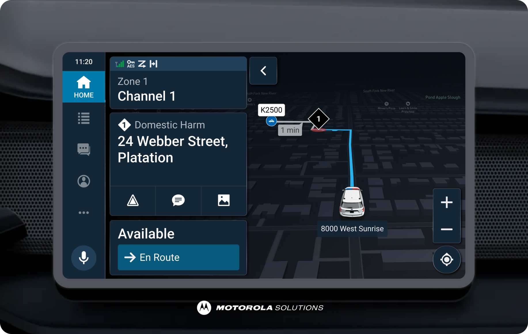
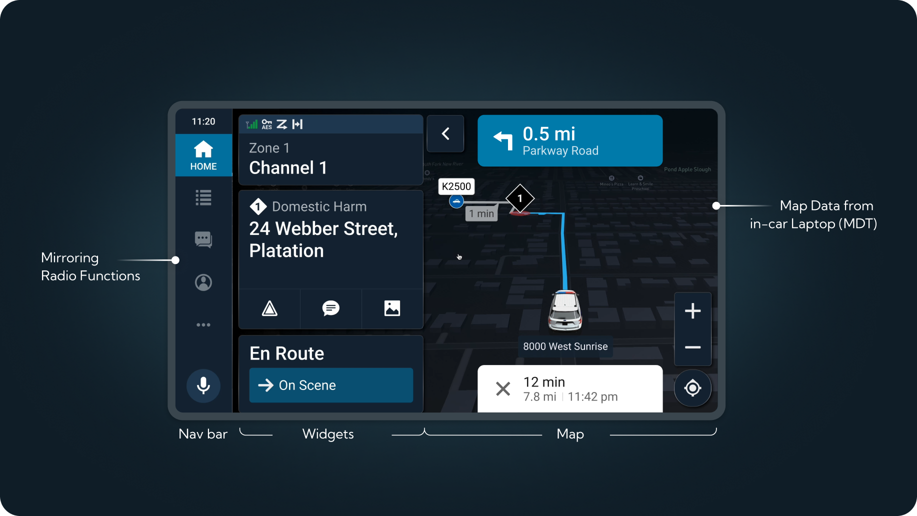
Centralized interface for critical information and control
By integrating frequently used features of the radio and consolidating location data from MDT into a single interface, officers can access and control critical information without switching devices.
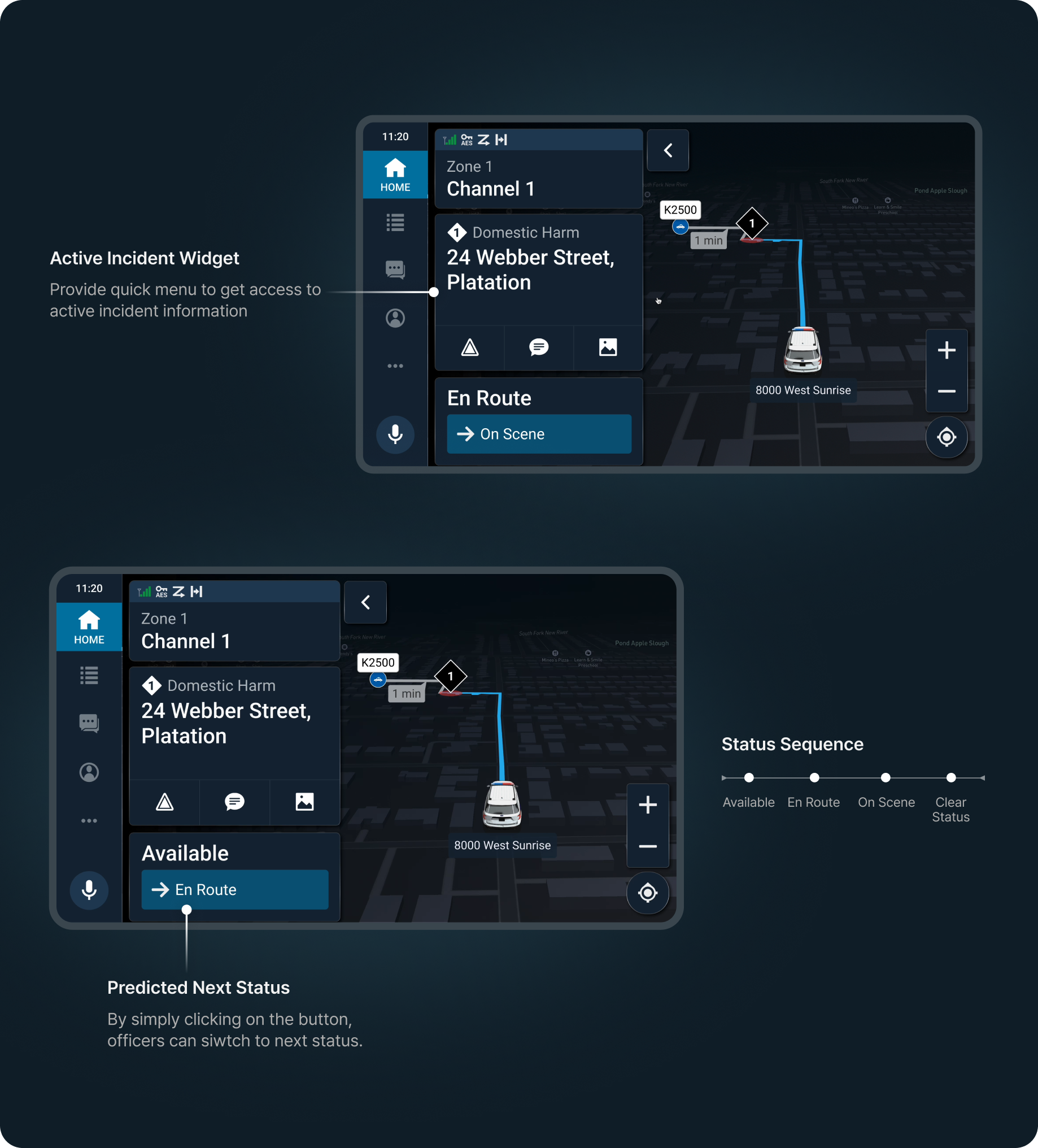
Minimized interaction time, maximized accessibility
The system displays big font size and keeps information density low to minimize navigation depth and reduce cognitive load while driving. Understanding the context, the system allows seamless use.
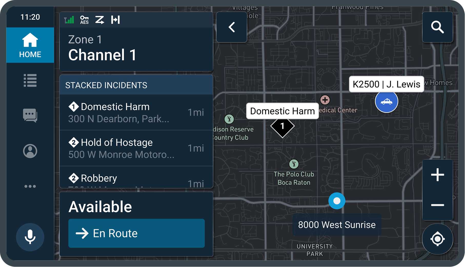
Enhanced situational awareness
The map displays incident locations, backup units, and priority lists, helping officers quickly assess situations and prioritize responses for improved situational awareness.
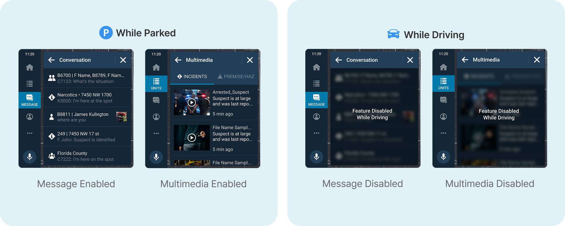
Locked features while driving
Abiding by NHTSA Visual-Manual Distraction Guidelines, message and multimedia features are limited during driving.
Design Decisions
Considering cognitive load and ergonomics
Conducting human guideline testing and 6 SME interviews, here are some of the decisions. Human factor user testing with 11 participants to evaluate the layout, ergonomics, and interaction models of the interactive prototype. Remote subject matter expert (SME) interviews with 6 participants to gather insights on the user interface and validate design choices. (SUS score: 91/100)
Map VS App View
According to 6 out of 6 SMEs, they needed the map to monitor field units to avoid collisions and enhance coordination. Also, the spatial layout of incident lists help easier call management.
SelectedMap-focused view
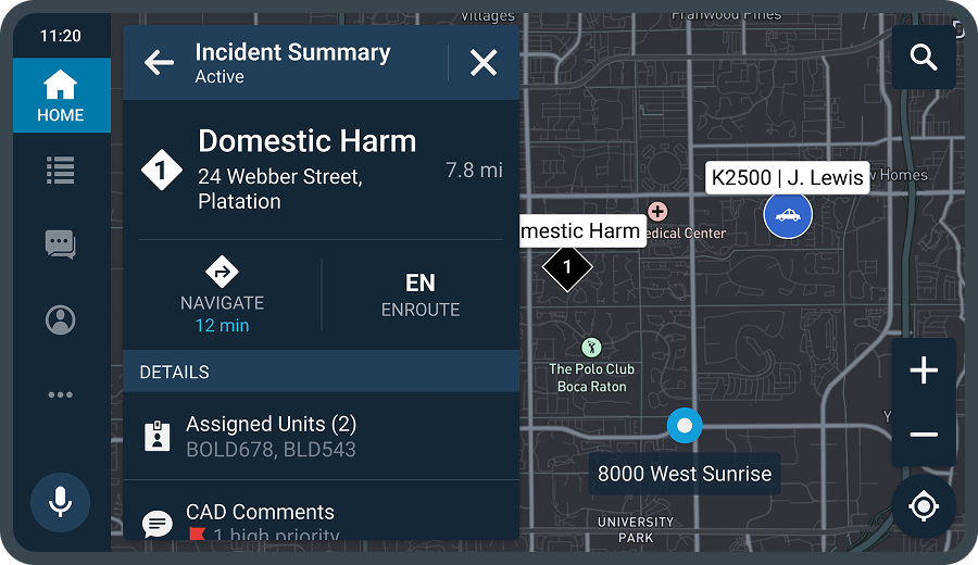
- Positive:Enhanced situational awareness
- Positive:Easy to compare options
Not selectedApp-focused view
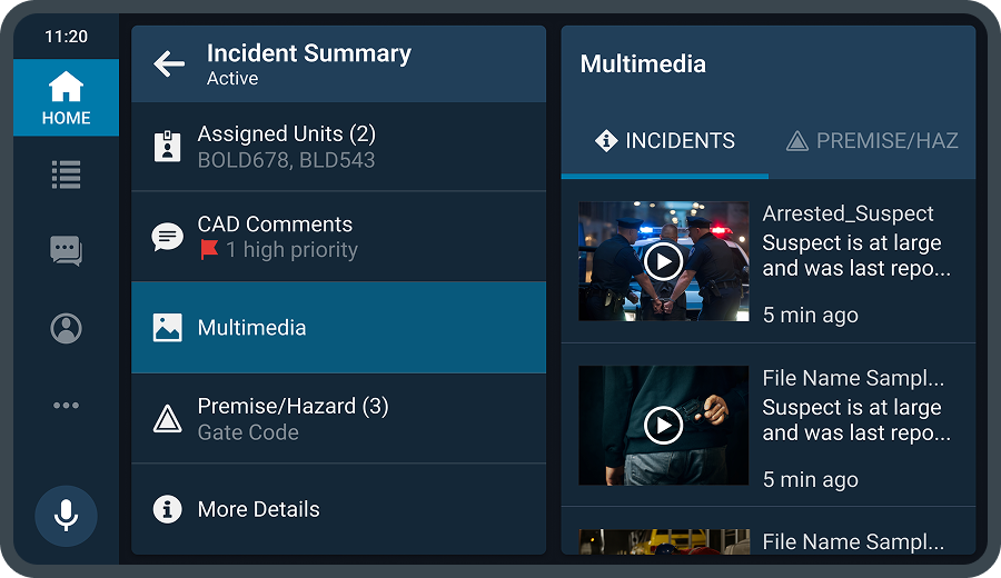
- Negative:Creates unintended visual hierarchy
- Negative:Includes trivial trip details
Moving Widget vs Fixed Placement
When no incident is assigned, the ‘Stacked Incidents’ widget was introduced to replace the active incident widget. This preserved consistent placement and provided a live overview of all ongoing incidents and assigned units, helping officers respond proactively.
SelectedDisplay Stacked Incidents
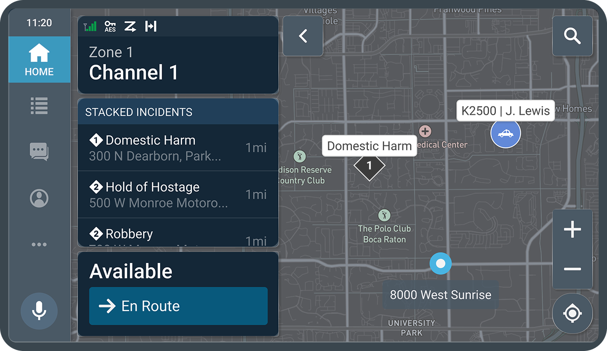
- Positive:Naturally prompted to review their itinerary once more
- Positive:Smoother flow leading into booking
Not selectedAligned top
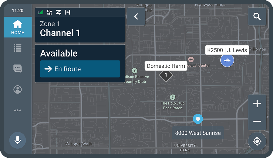
- Negative:Creates unintended visual hierarchy
Not selectedFixed position
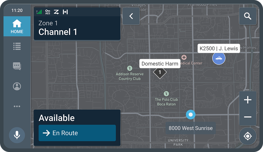
- Negative:Includes trivial trip details
Shift Manager Widget Explorations
The initial design showed a single budget bar per trip. It looked tidy but hid how policy actually works. Some corporate policies enforce spend by category, not by trip total. I redesigned the compliance view around category-level status so the agent’s reasoning became legible
BeforeSwipe to update status
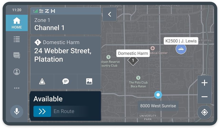
- Negative:Hard to swipe with gloves on
- Negative:Attracts too much visual attention
- Positive:Prevents accidental tap
AfterTap to update status
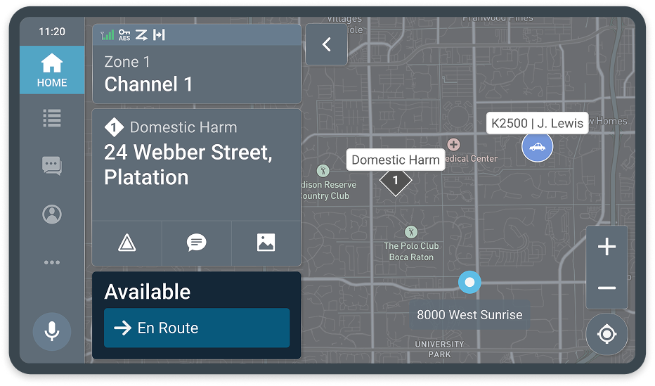
- Positive:Enhanced situational awareness
- Positive:Easy to compare options
Validation
Balanced agency between user and AI agent relieved the trust gap
The prototype was tested with 6 SMEs and achieved high ratings in clarity, usability, and overall efficiency, confirming its effectiveness in real patrol scenarios.
- System Usability Score
- 91/100
- Task Completion Rate
- 98.4%
- Presented to Global Staff Meeting
- 70+

I would definitely use this system frequently. It’s easy to use, not overly complex, and the different functions seem really well integrated.

Next Step
If I had more time…
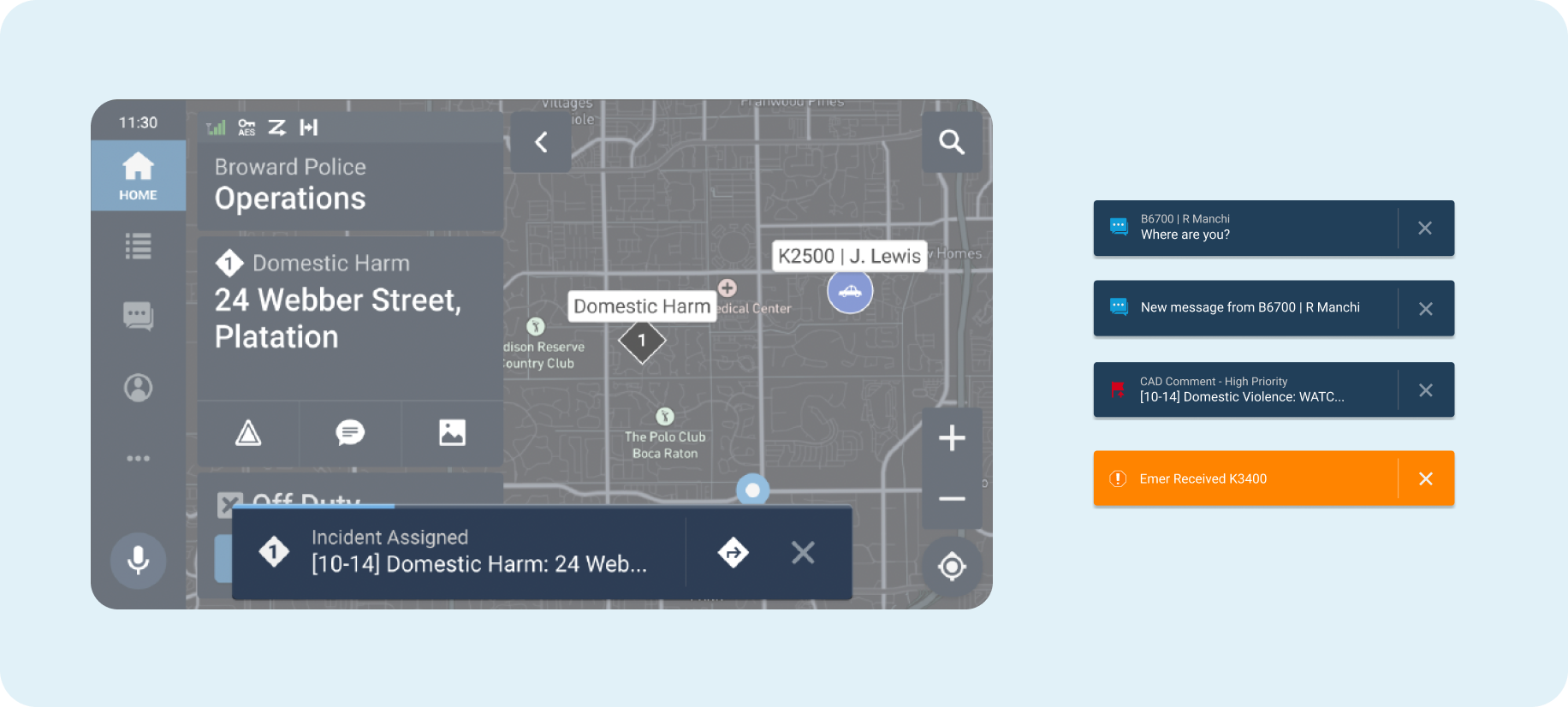
I would further develop on notification drawer and toast system. These were deprioritized during evaluation because dispatch voice announcements provided faster comprehension and auto-navigation to the incident screen reduced friction compared to a visualized pop-up.

Design System
In-vehicle design system
I would further develop on notification drawer and toast system. These were deprioritized during evaluation because dispatch voice announcements provided faster comprehension and auto-navigation to the incident screen reduced friction compared to a visualized pop-up.
Reflection
Learnings
Designing for a Multi-Device Ecosystem
Mapping the officer’s patrol journey across tablets, radios, MDTs, and in-vehicle screens taught me to design for an ecosystem, not a single screen. By studying existing apps, I learned which modality works best at each phase of the journey.
Validating Hypotheses with SMEs
Without deep domain knowledge, I relied on planned testing with SMEs to turn assumptions into evidence. Their feedback confirmed many of my design decisions and revealed clear areas for improvement.
Extending a Design System to a New Context
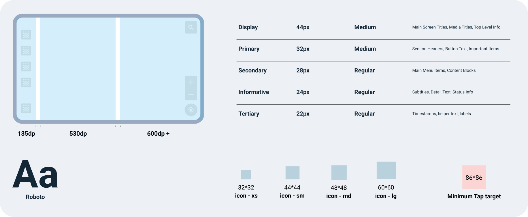
Starting from Motorola’s radio design language, I adapted it for in-vehicle use by enlarging type and tap targets and optimizing every component for driving. Creating vehicle-only components showed me how the environment shapes what the UI needs.
