Agentic AI Product
Balancing AI Agency and User Control in Booking Worktrips
- Shipped
- 0 → 1
- AI Product Design
Overview
How much should an AI agent decide on its own?
Worktrip Autopilot is an AI agent that plans, books, and manages business travel inside company policy. Describe a trip in plain language and it searches real flights and hotels, then returns three itineraries to compare. I designed and shipped it with a software engineer, then rebuilt the working product solo with Claude as my technical partner.
As the sole designer, I…
- Framed the agency vs control tradeoff and designed for it across the flow
- Collaborated with a developer, then with Claude, to ship and iterate the MVP
- Ran user testing across four versions and translated feedback into design decisions
- Owned visual craft and interaction design
What Improved
Impact
- Reduced task completion time
- -65%
- AI credibility score
- +28%
- Confidence rating
- +40%
Problem
AI agent can plan fast, but users felt low accountability
After user testing the initial MVP, three pain points surfaced. Although the AI agent could plan an itinerary in seconds, users hesitated to click Confirm & Book — they couldn’t see how decisions were made on their behalf.
Users couldn’t see why the agent recommended what it did
How much do you trust the options?
2.75 / 5
Couldn’t verify the agent’s reasoning before booking
How confident are you clicking “Confirm & Book”?
3 / 5
Users felt limited control over the customization
“I hope the itineraries are more micro adjustable…”
User 4

Design Approach
Splitting the flow into what the agent owns and what the user decides
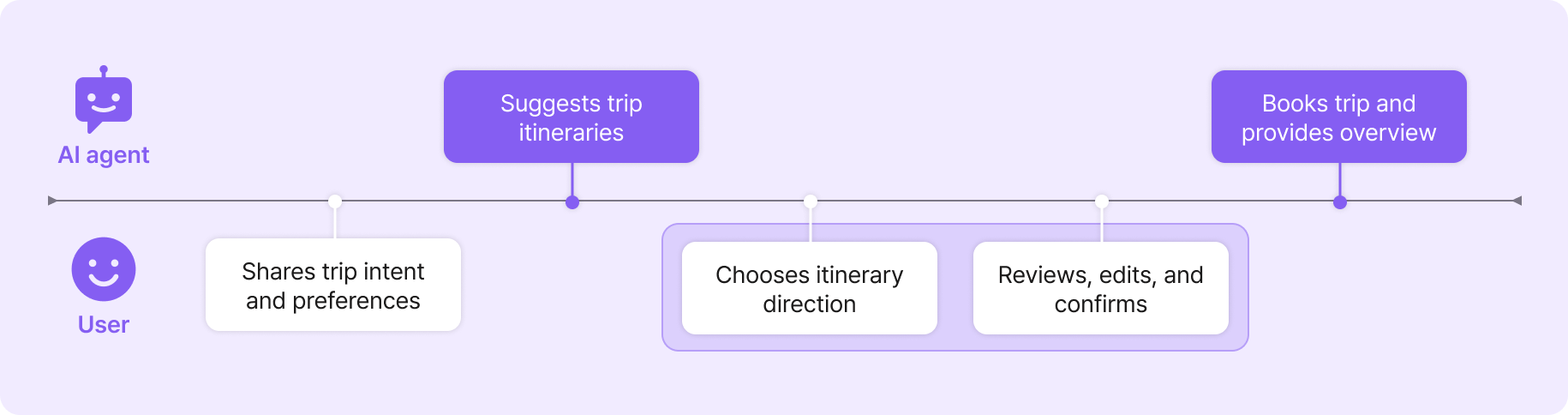
I mapped the flow decision by decision along the user journey to examine the balance between AI and user autonomy. User feedback pointed to one clear gap. The itinerary selection phase needed more user control.
Iteration
4 rounds of rapid prototyping
Using AI tools, I was able to iterate 4 versions of prototype within 2 weeks, focusing on the flow and usability.

Design Decision
Redefining the itinerary selection step
After V2, three problems surfaced at once: users couldn’t compare options cleanly, they hesitated at Confirm, and they couldn’t tell how policy was applied. Instead of patching each symptom, I reframed what the itinerary step was for.
Decision 1: Surfacing editing step
I restructured the user flow to choose high level itinerary type first, then surfaced editing. Making editing its own step gave users the review moment they’d been unconsciously seeking before proceeding.
BeforeItinerary selection & edit → Trip overview
- Negative:Editing capability was not discoverable
AfterChoose itinerary type → Edit → Trip overview

- Positive:Naturally prompted to review their itinerary once more
- Positive:Smoother flow leading into booking
Decision 2: Simplifying information in itinerary cards
Now that the user gets an editing step separately, the itinerary option card no longer needed to carry trip details like assigned seat or baggage policies. I reduced the cards to only what users need to choose a direction.
BeforeOne detailed option
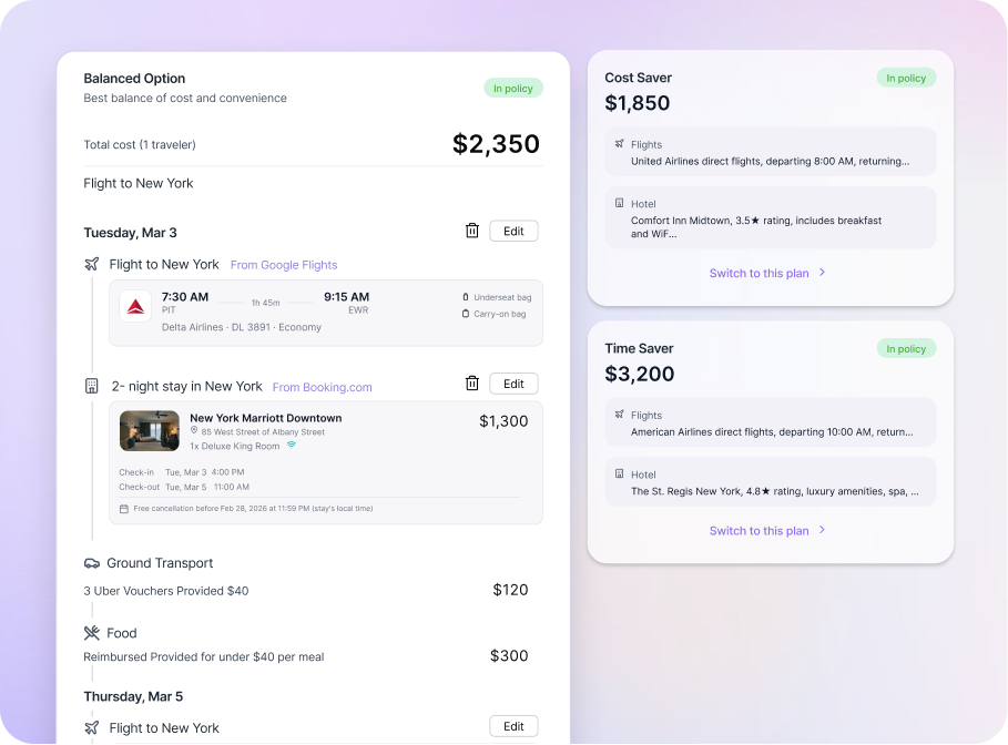
- Negative:Creates unintended visual hierarchy
- Negative:Includes trivial trip details
AfterThree simplified options
- Positive:All options look equal
- Positive:Easy to compare options
Decision 3: Redesigning spend visibility for policy compliance
The initial design showed a single budget bar per trip. It looked tidy but hid how policy actually works. Some corporate policies enforce spend by category, not by trip total. I redesigned the compliance view around category level status so the agent’s reasoning became legible.
BeforeBudget centered itinerary view
- Negative:One trip total hid how policy is actually enforced
AfterPolicy driven compliance view
- Positive:Category level status made the agent’s reasoning legible
Usability Audit
Establishing trust throughout the interface
At the moments when users needed more feedback to trust the system and itinerary suggested by the agent, I designed specific UI solutions throughout the booking flow.
Intent confirmation before agent runs
Users know the agent understood them before it commits to searching
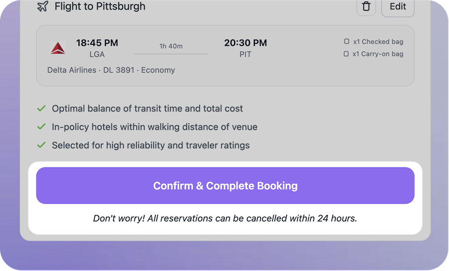
Reassurance copy
Users know what happens after they click, and how to undo it
Explainable AI suggestions
Users see why each option was chosen, not just what was chosen
Final Design
Final flow

Validation
Balanced agency between user and AI agent relieved the trust gap
The revised design was tested with 8 business travelers across two moderated sessions.
- Reduced task completion time
- -65%
- AI credibility score
- +28%
- Confidence rating
- +40%
Reflection
Learnings
AI agent autonomy vs. user trust
In high stakes contexts, too much AI autonomy destroys trust. The key was reducing user effort without taking away their final decision.
Balancing business constraints and user value
I learned to balance corporate cost saving goals with employee comfort. The challenge was turning competing priorities into a transparent, fair UI.
Learning through iterative vibe coding
Iterative vibe coding sharpened my prompting intuition. It also gave me the front end knowledge to collaborate seamlessly with engineers.